


Skip to content
View in the app

A better way to browse. Learn more.

BariatricPal

A full-screen app on your home screen with push notifications, badges and more.

To install this app on iOS and iPadOS
  1. Tap the Share icon in Safari
  2. Scroll the menu and tap Add to Home Screen.
  3. Tap Add in the top-right corner.
To install this app on Android
  1. Tap the 3-dot menu (⋮) in the top-right corner of the browser.
  2. Tap Add to Home screen or Install app.
  3. Confirm by tapping Install.

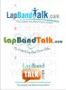
New LBT LOGO

  • Replies 11
  • Views 1.4k
  • Created
  • Last Reply

Top Posters In This Topic

Posted Images

Which LOGO do you like best for LBT ? 1 member has voted

  1. 1. Which LOGO do you like best for LBT ?

Please sign in or register to vote in this poll.

Featured Replies

I agree, actually having a band in the logo is kinda cool----and might actually help those researching to understand there is really nothing hanging out of you or anything!!! I have to laugh at some of the uninformed questions we get!!!!

So #2 would get my vote too, although I like them all my choice would be #2.

Kat

They're all nice! No criticism here, because they'd all work fine. I've just been on both ends designing and selecting logos, so just my 2 cents, since you asked.

1. Emphasis on person, get the "T", but what does the person add...exercising? This one was a no for me.

2. I would also like to see the actual band in a logo, but #2 was way too busy for me; different lettering styles, colors, big bend, harder to read lettering, complicate it.

3. I chose #3 because it's simple and easily read, I've always found the simplier the better. Take #3 and add a simple graphic of the lap somewhere (as the actual frame for the "TALK" balloon or even around the whole logo) and it would have been a home run for me.

Good Job!:rolleyes:

3. I chose #3 because it's simple and easily read, I've always found the simplier the better. Take #3 and add a simple graphic of the lap somewhere (as the actual frame for the "TALK" balloon or even around the whole logo) and it would have been a home run for me.

I voted for 2. but I think Band_Groupie's suggestion is great.

My eye was immediately drawn to number three. It is simple and neat. I agree that it would be cool to have a picture of the Lap Band in the logo but number two just seems a little to chaotic.

Number 2!!!

That's perfect!

Join the conversation

You can post now and register later. If you have an account, sign in now to post with your account.

Guest
Reply to this topic...

Trending Products

PatchAid Vitamin Patches

Account

Navigation

Search

Search

Configure browser push notifications

Chrome (Android)
  1. Tap the lock icon next to the address bar.
  2. Tap Permissions → Notifications.
  3. Adjust your preference.
Chrome (Desktop)
  1. Click the padlock icon in the address bar.
  2. Select Site settings.
  3. Find Notifications and adjust your preference.